Biological Safety Cabinet
Project
Create a 7" interactive touchscreen display for an updated line of biological safety cabinets
My Responsibilities
Worked with a UX researcher, industrial designer, product manager, and a global team of software and hardware engineers to define the requirements for the biological safety cabinet and the interface.
- Leveraged findings from competitive usability testing to help inform product requirements
- Led weekly virtual sessions to define features and functionality, user and screen flows.
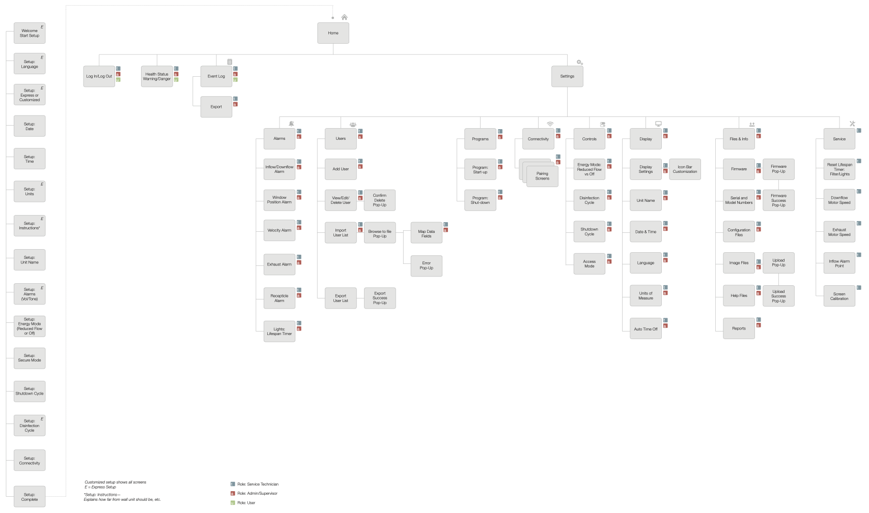
- Created sitemaps, user and screen flow diagrams, wireframes, and visual designs.
- Created interactive prototypes from initial concepts for usability testing both in-person and virtual.
- Revised designs based on feedback from participants during usability testing.
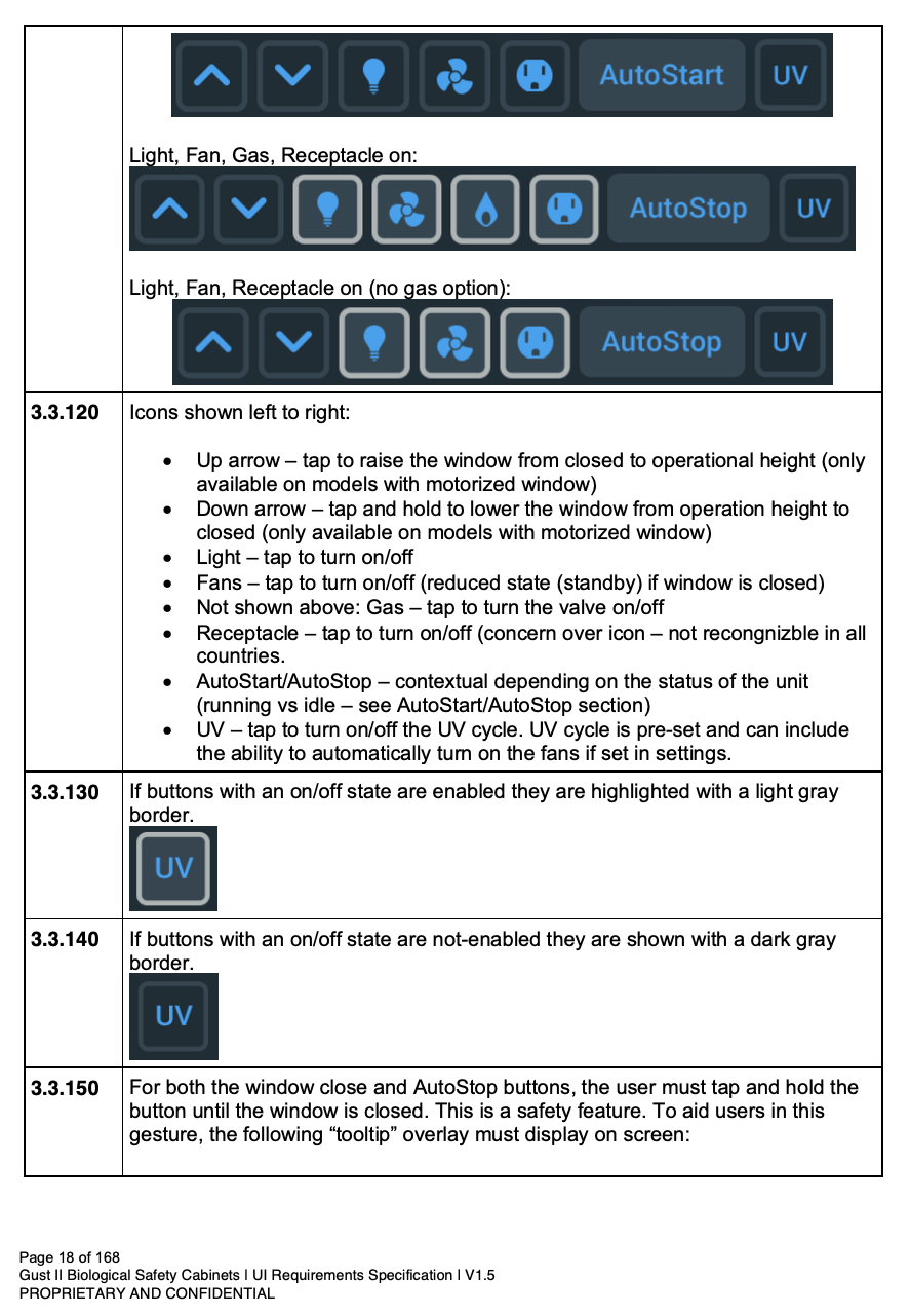
- Documented thoroughly the entire interface and provided all assets for off-shore development team.
- Reviewed development in-process to ensure design intent was being followed and offered additional support for revisions or scope changes during product implementation.
In addition to the visual design, I hired and worked with a sound design company to create a series of alarm and alert tones to be used on our branded products.
Insights
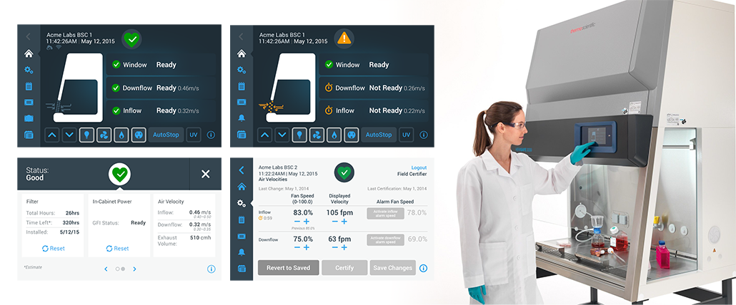
Initial working sessions with the product team had us focusing on highlighting the technical specifications on the interface for air speed. During early usability testing we learned that users didn't really understand the air velocities—they just wanted to know whether the cabinet was ready or not. This information helped us to align with the product team to de-emphasize the technical information on-screen and focus more on what the users really wanted to see.


