Shaker
Project
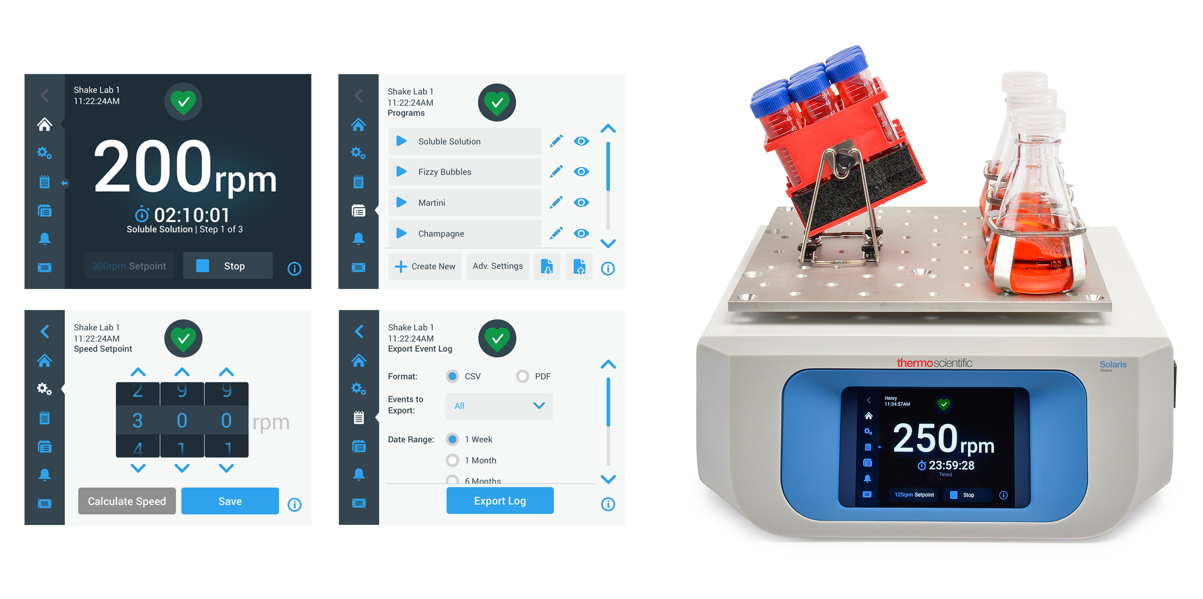
Create a 5.7" interactive touchscreen display for an updated line of orbital shakers
My Responsibilities
Worked with a UX researcher, industrial designer, product manager, and a global team of software and hardware engineers to define the requirements for the shaker and the interface.
- Leveraged findings from competitive usability testing to help inform product requirements.
- Led an initial design workshop to define the product and explore potential interface types.
- Led weekly virtual sessions to define features and functionality, user and screen flows.
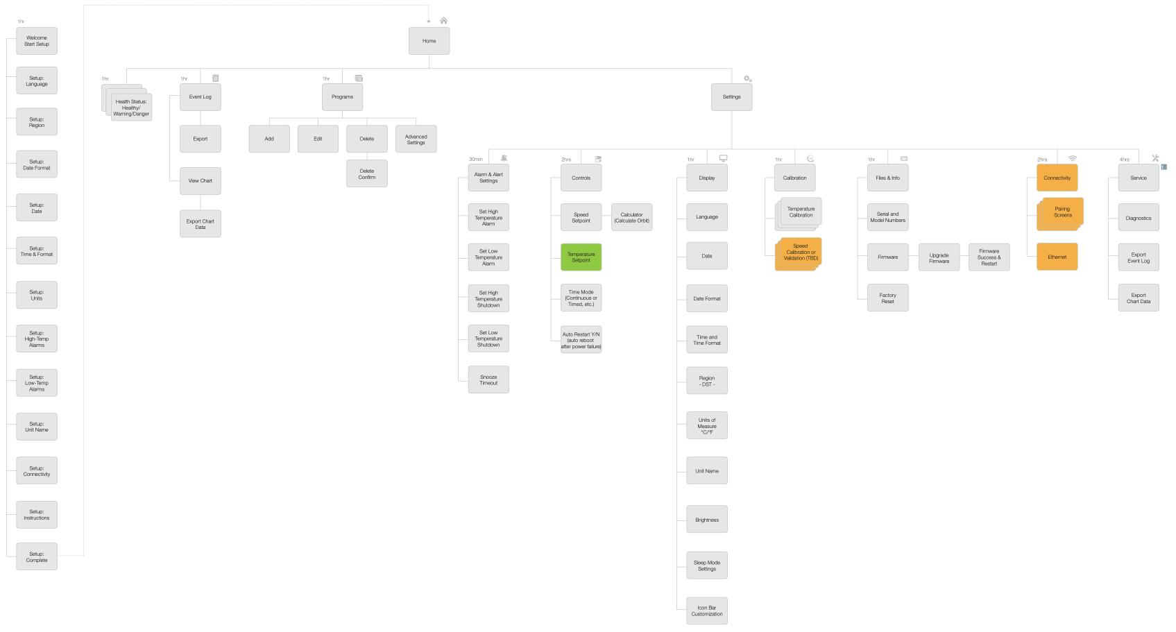
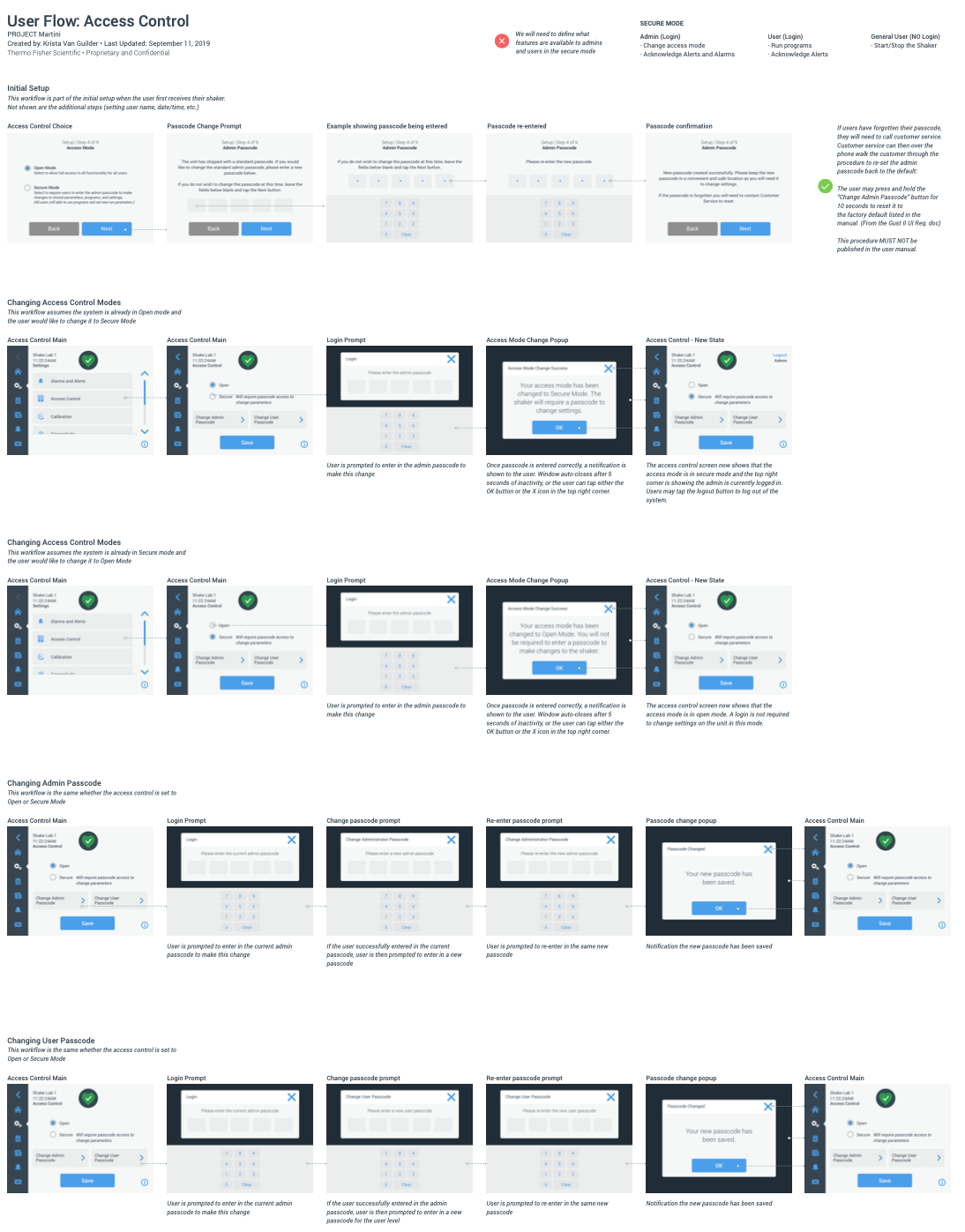
- Created sitemaps, user and screen flow diagrams, wireframes, and visual designs.
- Created interactive prototypes from initial concepts for usability testing both in-person and virtual.
- Revised designs based on feedback from participants during usability testing.
- Documented thoroughly the entire interface and provided all assets for off-shore development team.
- Reviewed development in-process to ensure design intent was being followed and offered additional support for revisions or scope changes during product implementation.
Insights
Our initial requirements included a button to "pre-heat" the incubated shakers. The pre-heat button had been on the previous version of the shakers and the team was adamant it needed to be included on the re-design.
We knew there was going to be some confusion around the button, so in anticipation created several variations to show to participants in the event they weren't sure what the button did.
During usability testing, all participants incorrectly guessed what the button was for, and when told what it was said they would have no need for the feature. We showed several variations of icons and labeling to the participants to see if any of the other options resonated better for them. We then swapped the button out for the next participant and repeated the test—only to find that they too did not understand the button, and when asked if there was a better icon/label option, selected something different.
After our 5th participant, the product manager announced that they wanted to remove the button from the interface completely. We avoided going to market with a button that users didn't understand nor wanted to use in their everyday workflow.


